2024 / mobile app
Repairing the pricing experience at Concepts
Concepts had a checkout abandonment problem. Users were dropping off before subscribing and flooding support with the same question: "I don't understand what I'm paying for." Here's how I figured out the price point was never the real issue, and what I did about it.
Role: growth product designer
produced at: concepts
The Problem
I use Concepts myself. It's actually my go-to tool for early-stage sketching and working through design ideas. So when I started digging into why users were abandoning checkout, I had a gut feeling it wasn't about the price.
What I found confirmed it. Support tickets were piling up with variations of the same frustration: users didn't know which plan they needed or what was actually included. I dug into forums, community discussions, and anywhere Concepts came up online. The signal was consistent. People weren't scared off by the cost, they were confused by the experience of trying to figure out what they were buying.
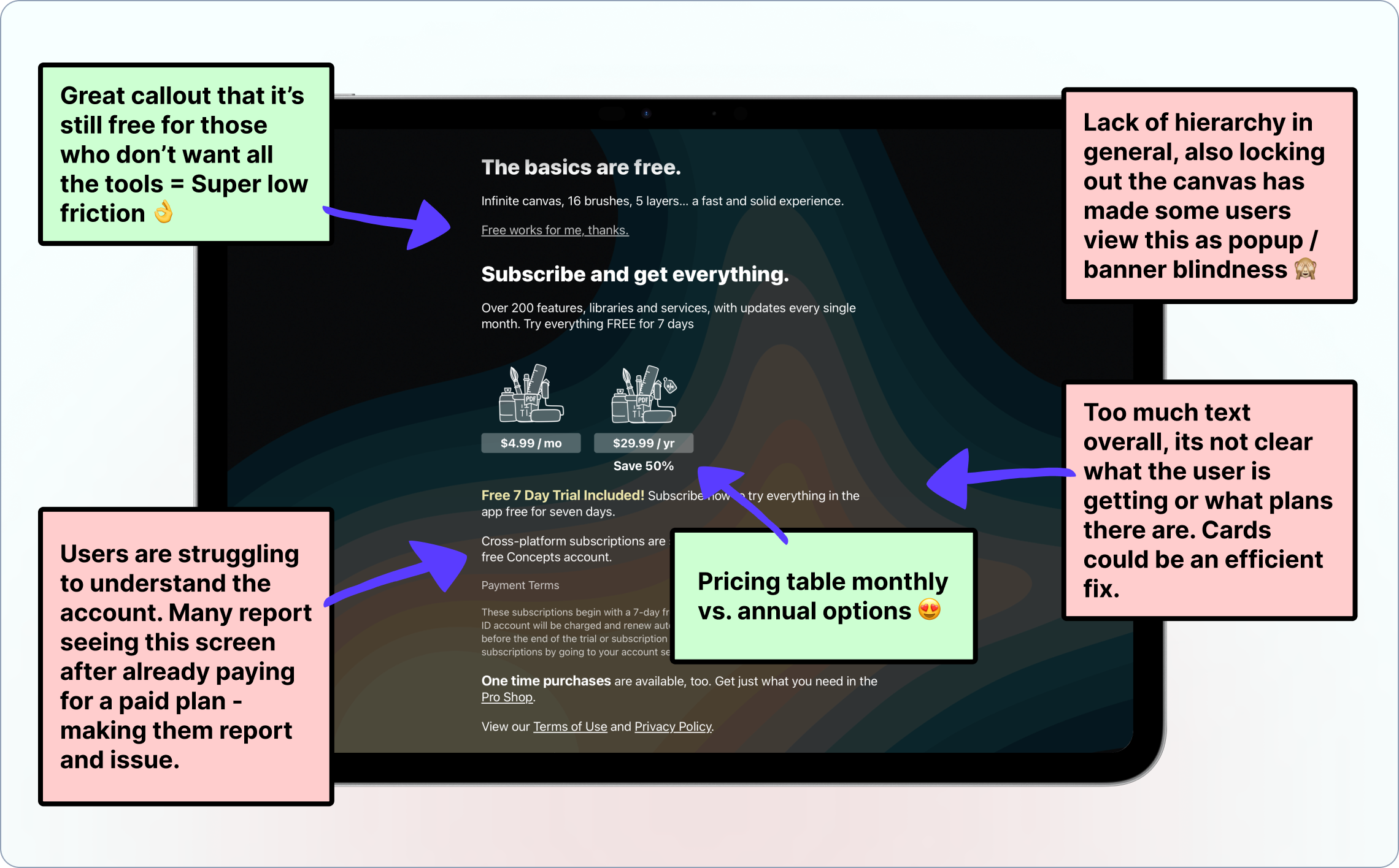
The existing pricing flow was a full-screen modal that showed plan names and prices. That was essentially it. No feature breakdown, no comparison between tiers, no way to understand what made one plan worth more than another. Users were being asked to make a purchase decision with almost no information to make it.
To help my team understand these issues, I ran a live workshop where we reviewed the current designs together and sticky-noted every issue (as well as every benefit) of the current design based on our research.
Making things more interesting: there was no online resource to turn to either. No pricing page on the website, no FAQ, nothing. So users who wanted to do their research before buying had nowhere to go. They'd hit a wall, leave the app, open a browser, find nothing useful, and either abandon or submit a support ticket.
“I don’t understand which plan I need. Which one did I start with? I don’t want to pay for a subscription if I don’t need it for the tools I want to use.”
User feedback
via support channel
The Insight
This is what reframed the whole project for me: the pricing itself wasn't confusing. The plans were reasonable. The costs were fair. The problem was purely a presentation problem. Users were being asked to commit without ever being shown the value of what they were committing to, often neglecting the pricing screen as it resembled a nag screen.
I immediately began mocking up early-stage design ideas to validate.
The Solution
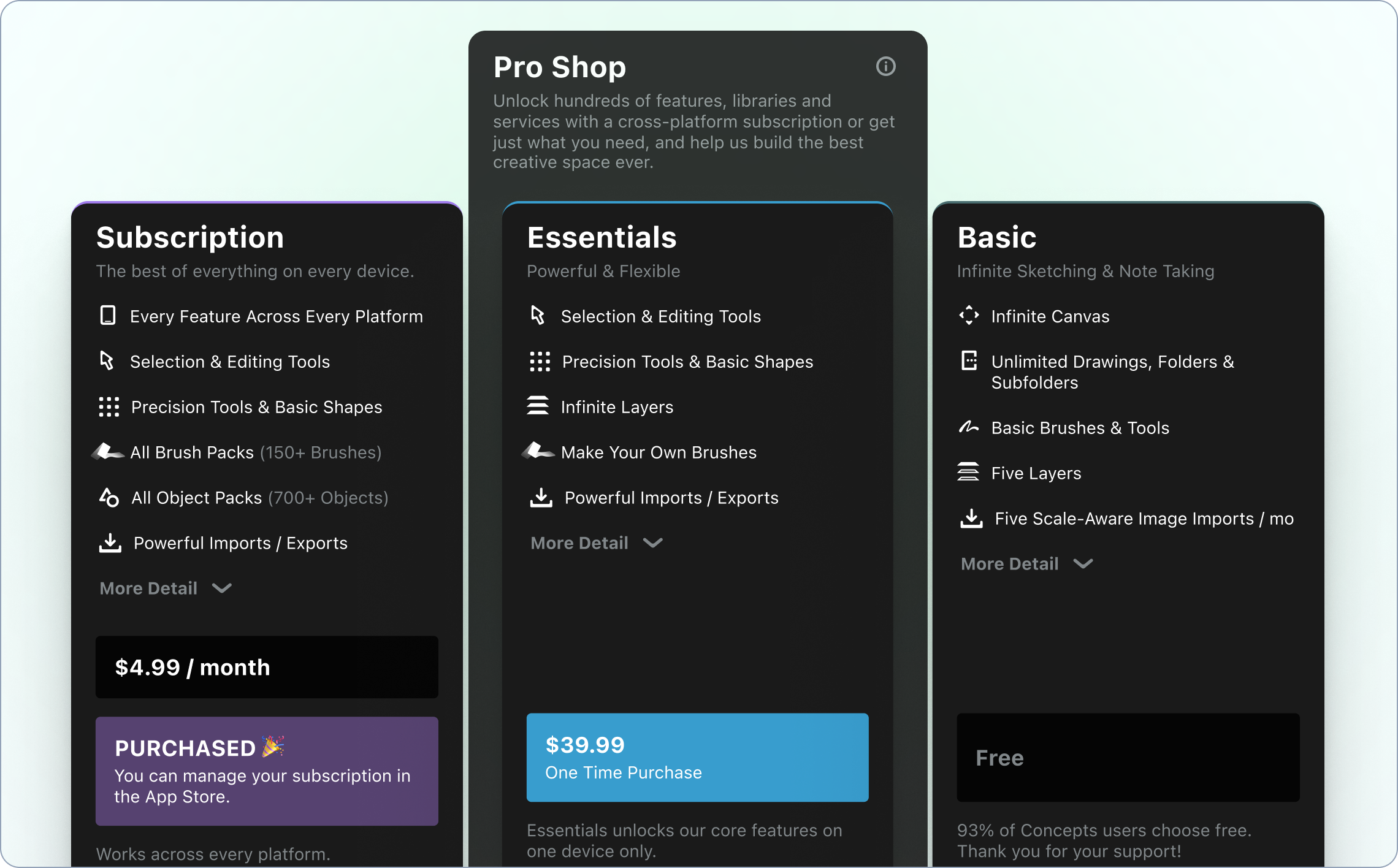
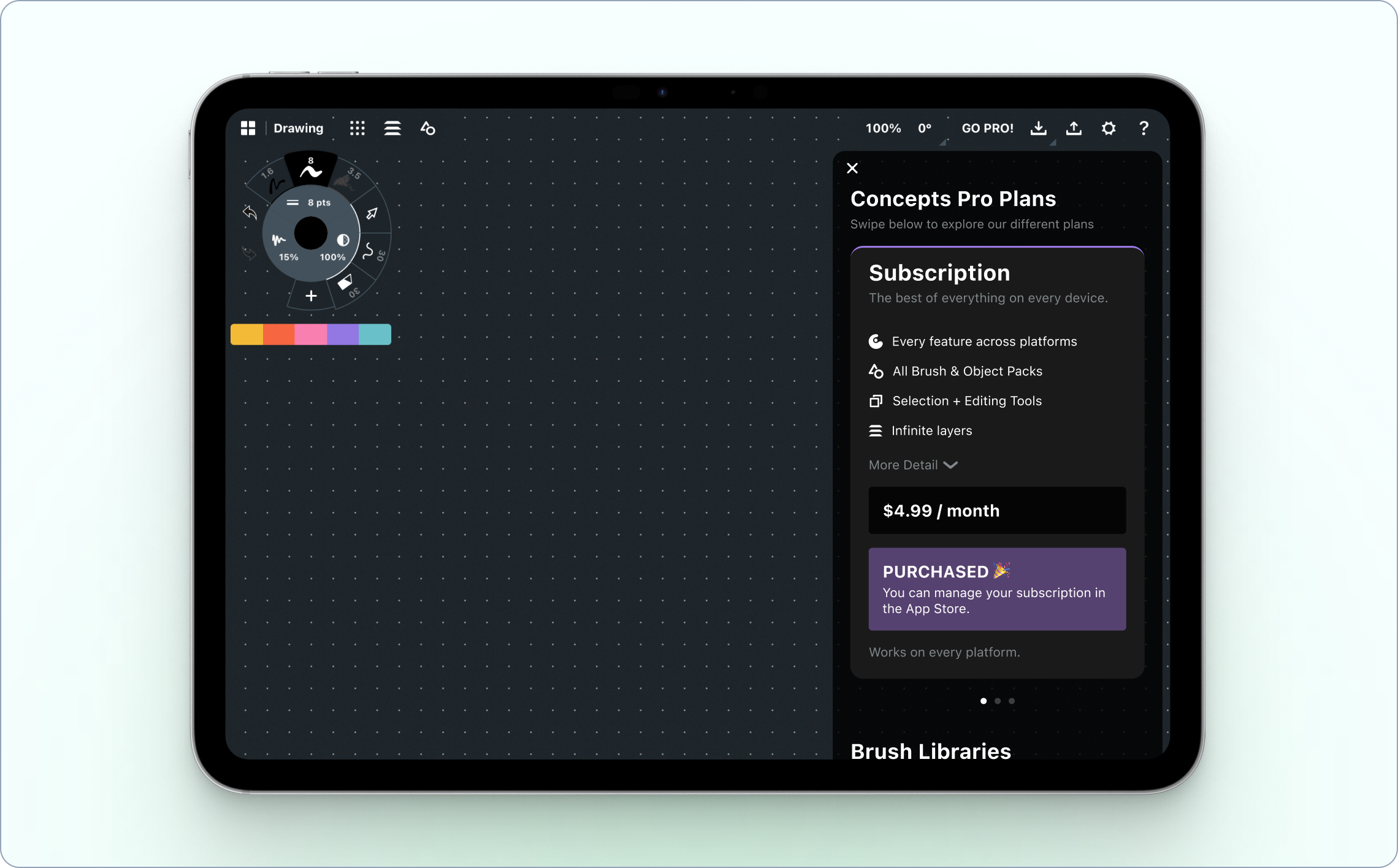
I redesigned the in-app pricing UI from the ground up, replacing the bare modal with a proper pricing card experience. Each plan now clearly displayed what was included, making it easy to compare tiers side by side. The goal was to give users enough context to make a confident decision without needing to leave the app or contact support, in a container that better represented a pricing menu rather than a nag screen.
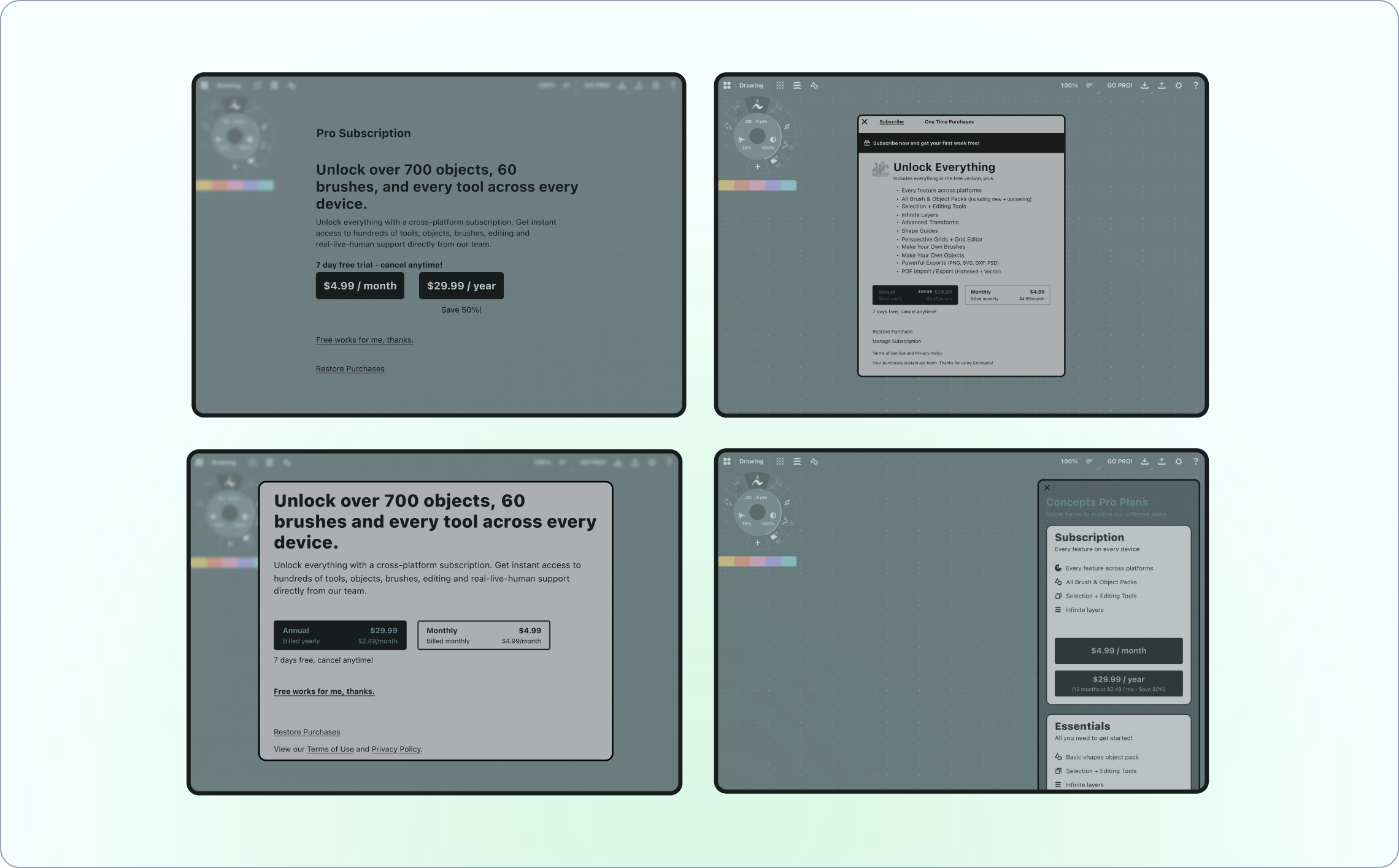
I started with a V1 version of pricing cards which we user-tested for clarity via a simple Figma prototype.
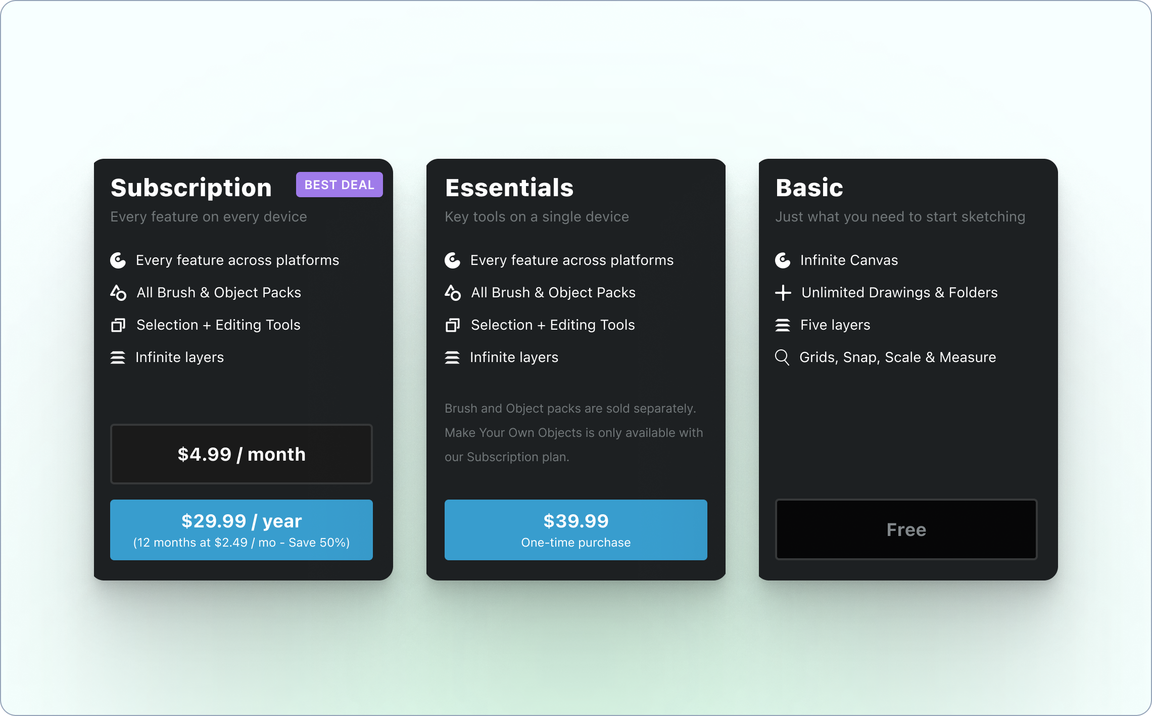
I then refined the cards based on the feedback we received to create what we hoped would be the perfect solution to our confusion issues. I focused on differentiating the cards, making it easy to see all features, and better presenting the swipe functionality by adding an indicator and a subtle animation to the initial card.
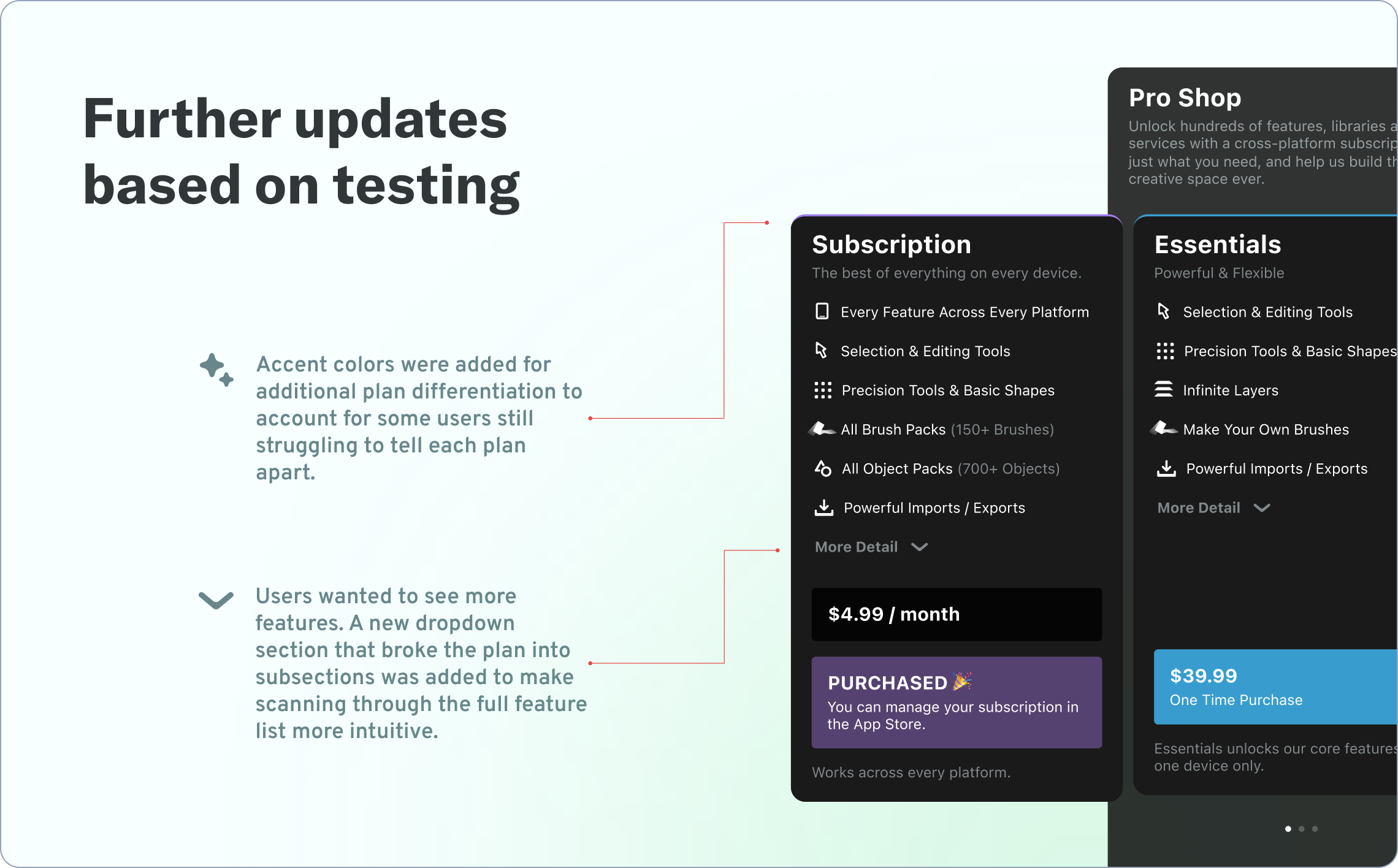
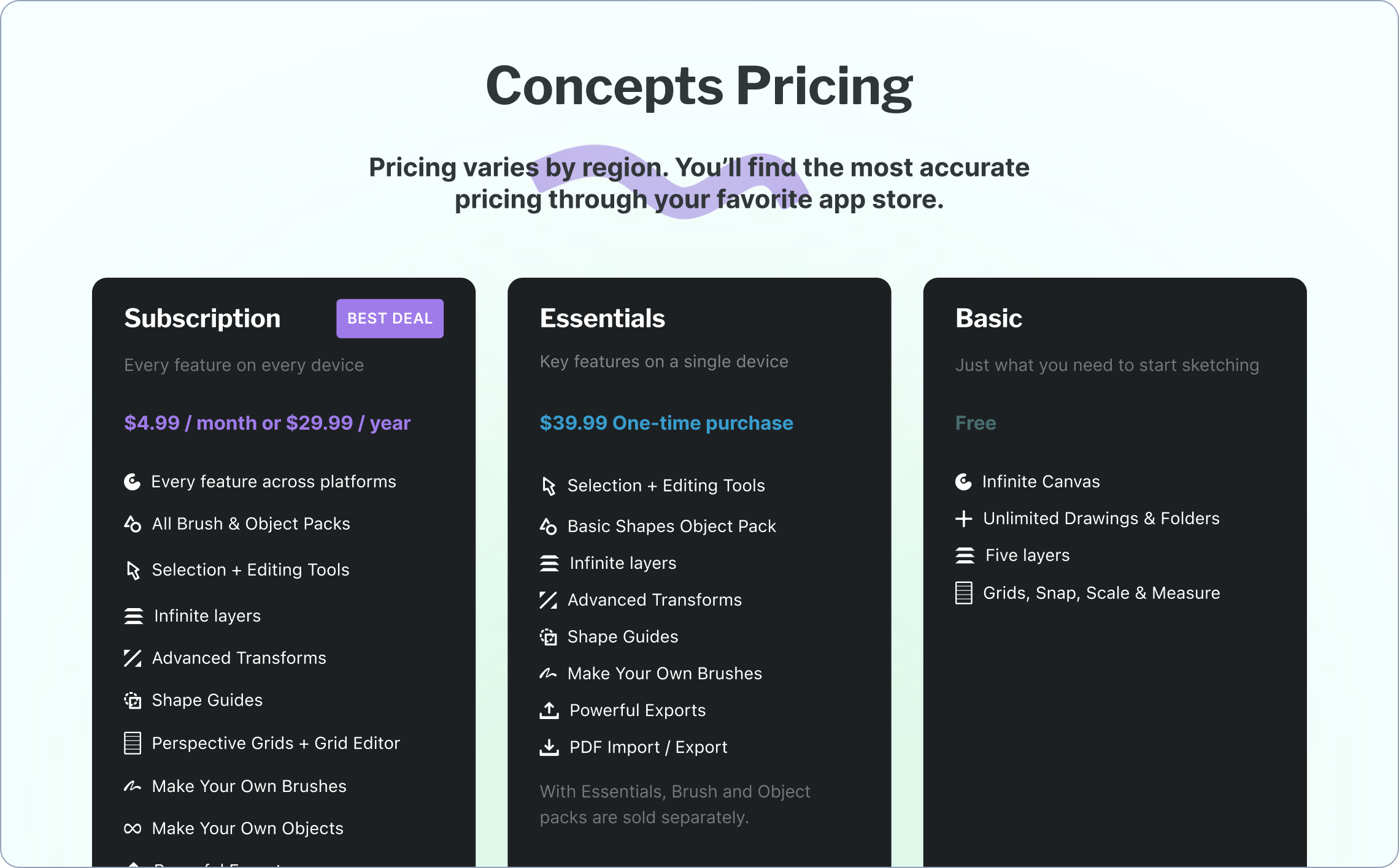
But the discovery that users were jumping to the browser before attempting to purchase opened up a second opportunity. I designed and built a dedicated pricing page for the Concepts website, something that hadn't existed before. Now users who wanted to research before buying had a place to land, with the same clear feature breakdowns and plan comparisons they'd find in-app.
The two surfaces reinforced each other: whether a user decided to research first or dive straight in, they'd encounter consistent, clear information about what they were getting.
The Results
Support tickets about pricing dropped noticeably after the redesign shipped. More meaningfully, conversion rates increased significantly, which suggested that the confusion wasn't just a support burden, it was actively blocking purchases from people who actually wanted to subscribe.
What I Learned
This project was a good reminder that the most important part of research isn't confirming what you already think. It's staying open to what the data is actually telling you. My initial instinct going in was that the pricing structure might need rethinking. What I found instead was that the structure was fine, and the real problem was much more solvable.
It also reinforced something I believe pretty deeply about monetization design: users don't resist paying for things they understand and value. The job isn't to convince them. It's to make sure they have what they need to convince themselves.
"Cody's ability to wear many hats and versatile background and skills made him an essential Swiss Army knife on our team. Cody is super thorough in his communication and makes sure to explain the value and reasoning behind growth design decisions and how to put customers at the core of everything we do and say. He is one of the few designers that I trust completely."

Annelise Sandberg
Head of Product @ Concepts
2025 / mobile app
Solving the cold start problem for Marco Polo's contact-less users
Our goal was to solve the cold start problem for users who entered Marco Polo without any contacts - giving them a clear path to their first conversation instead of an empty, confusing home screen. Here's how I designed a privacy-respecting solution that worked within iOS 18's new permission constraints.
Role: growth product designer
produced at: marco polo
The Problem
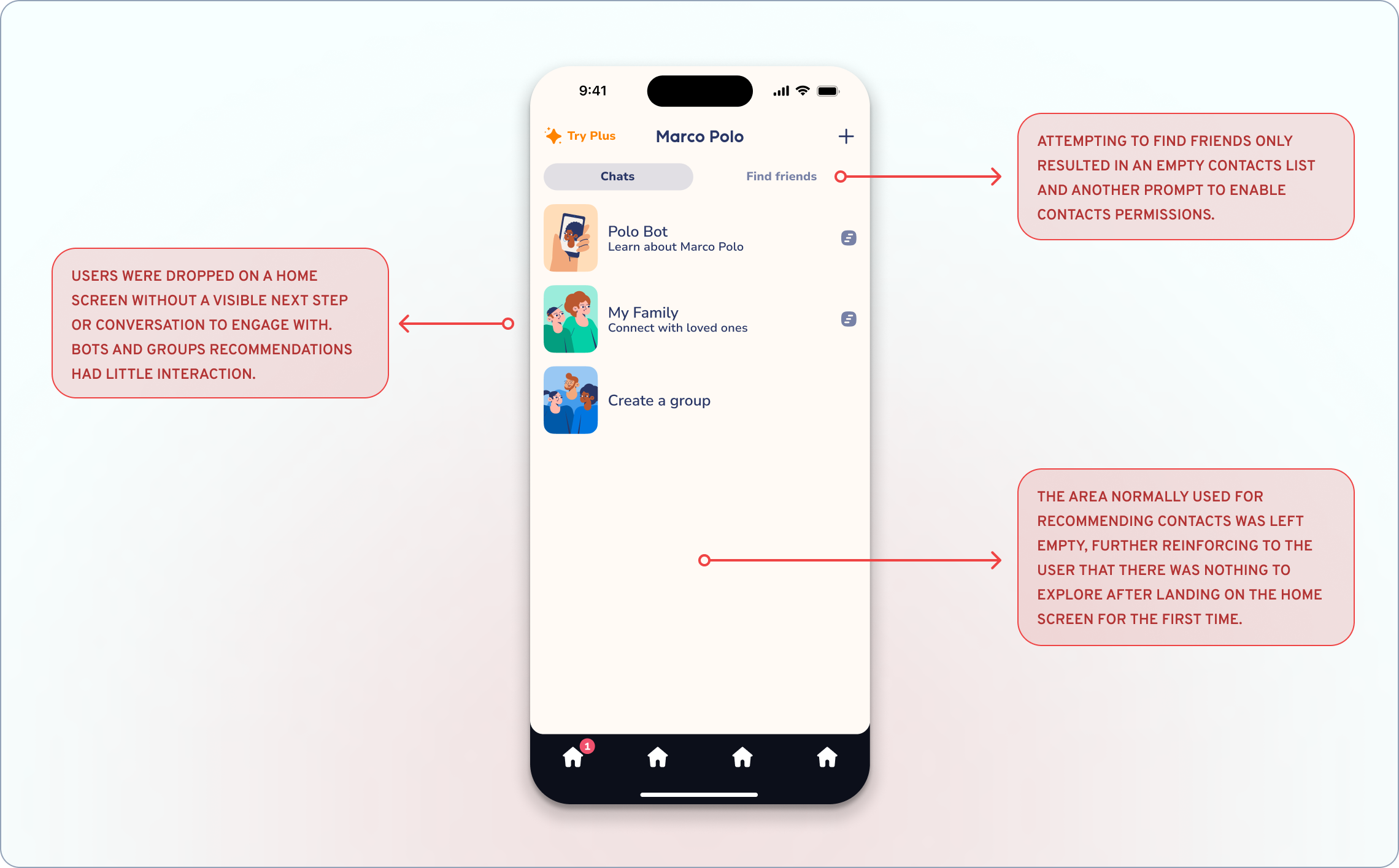
Picture this: you download Marco Polo, excited to start sending video messages to friends and family. But when you open the app, you're staring at an almost empty home screen. No conversations. No suggested contacts. No idea what to do next.
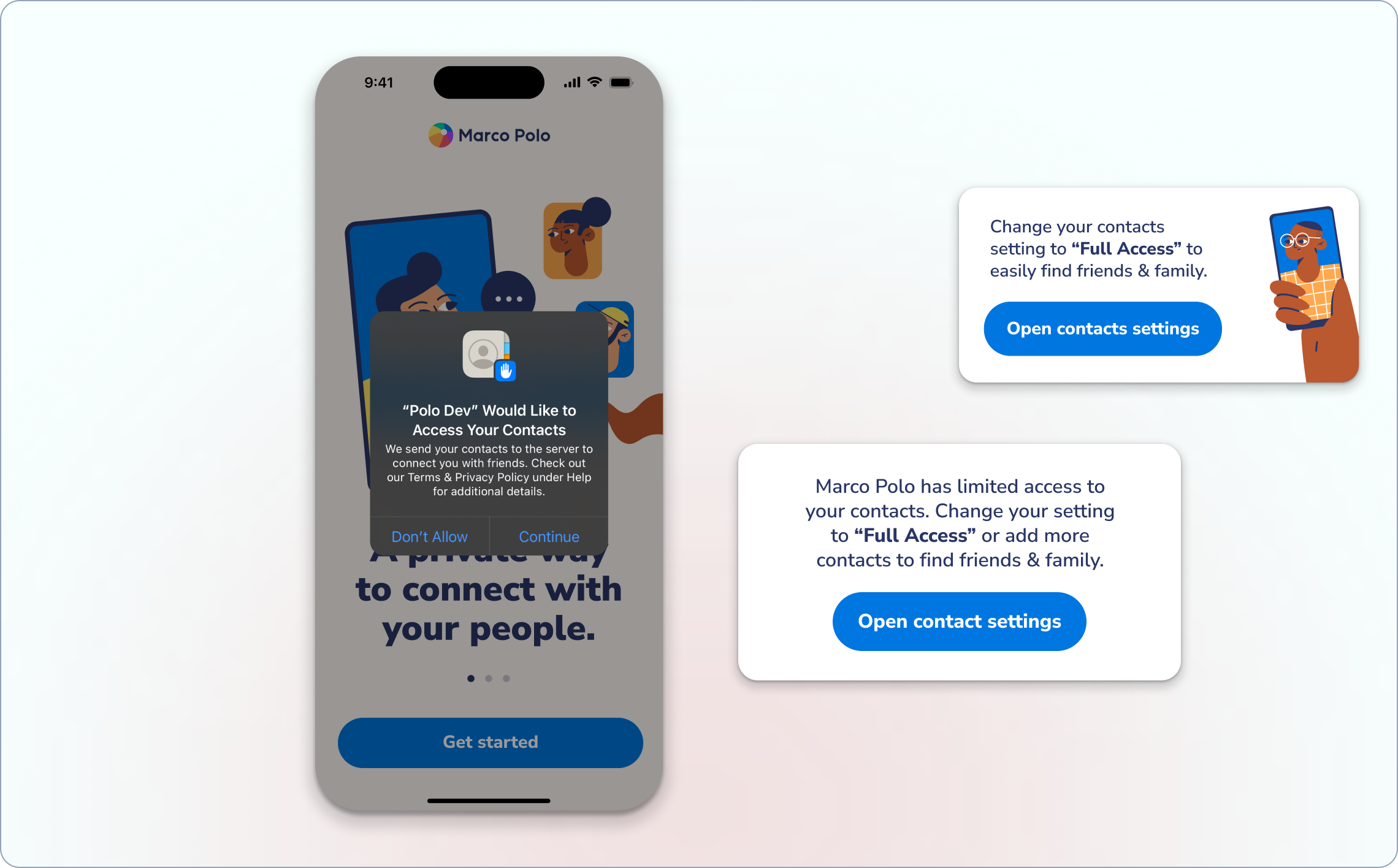
When iOS 18 launched, Apple introduced more granular contact permissions: users could now choose "limited access" instead of the traditional all-or-nothing approach. While this was great for privacy, it meant more users were entering Marco Polo without any visible contacts for us to recommend. We were essentially dumping people into an empty room and expecting them to figure out how to invite their friends.
Not exactly the warm, welcoming experience Marco Polo is known for.
Understanding the Constraints
iOS 18 threw us a curveball and the challenge was clear: How do you help someone start their first conversation when you can't see who they know and they have already denied access to their contacts?
The constraints were also real:
• iOS requires users to change their initial decision in Settings
• Users were increasingly privacy-conscious
• Our brand voice is warm and kind—not pushy
• The solution needed to feel natural, not like a workaround
Research Revealed the Frustration
I ran user interviews and set up research sessions using Maze to understand what was actually happening when users hit this empty state. Users wanted to connect with someone, but they also valued their privacy. The current flow forced them to choose between the two.
The feedback was consistent:
"Wait, so what now? I thought I'd be able to just add my mom or something, but it's asking for all my contacts. That seems like overkill for just trying out the app.”
User interview response
conducted in-person
The Solution: A Friendlier Way In
Instead of asking users to hand over their entire contact list, what if we made it easier to add just one person? After all, a big part of our mission at MP was to connect with close, meaningful contacts.
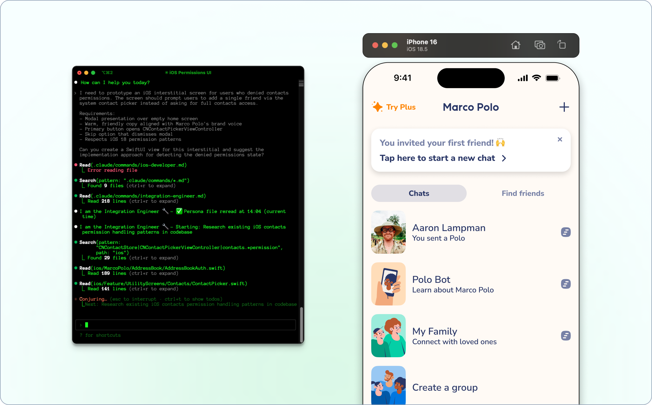
To experiment with this idea, I designed a simple interstitial flow that fires when a user has denied contacts permissions.
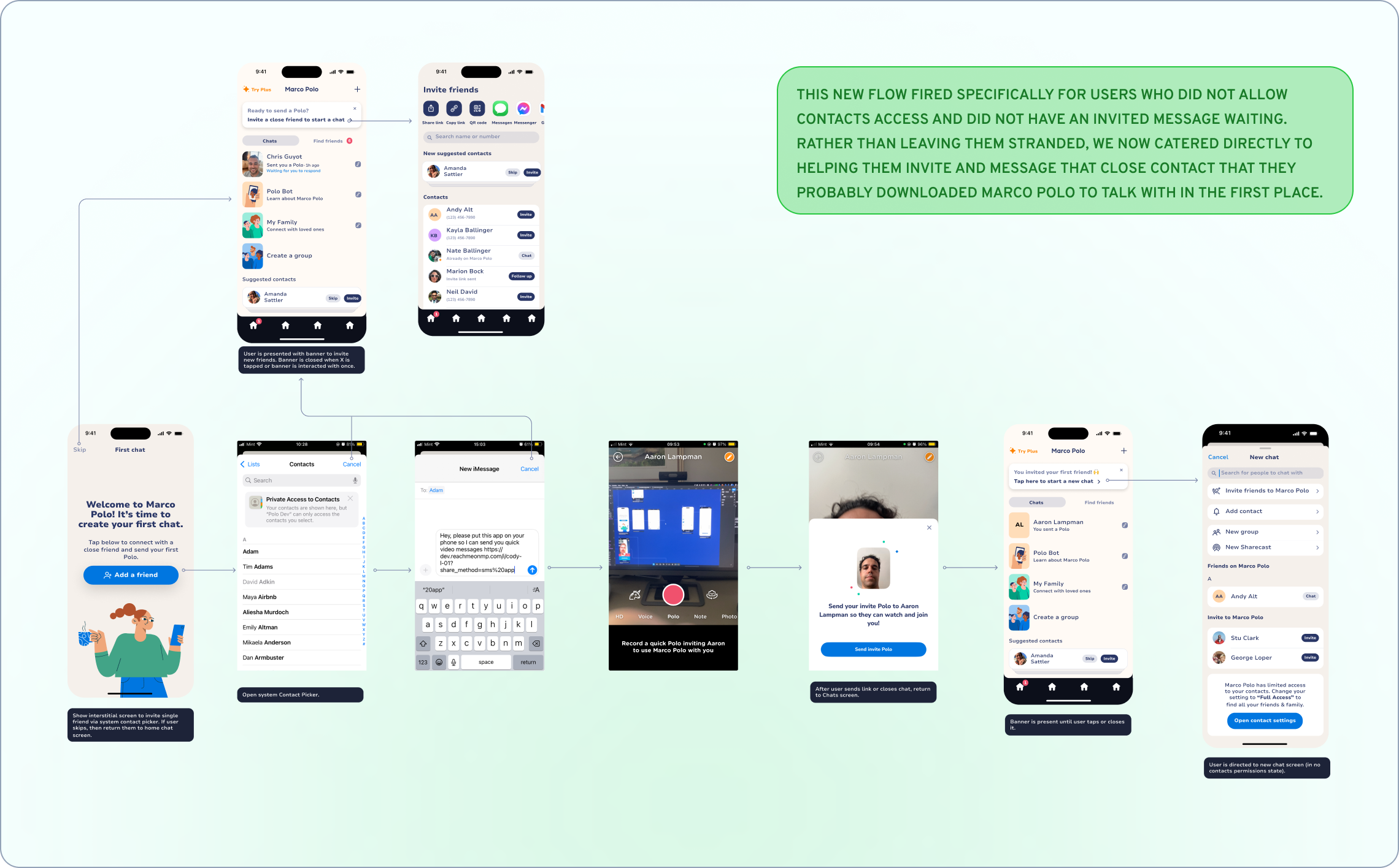
The Flow:
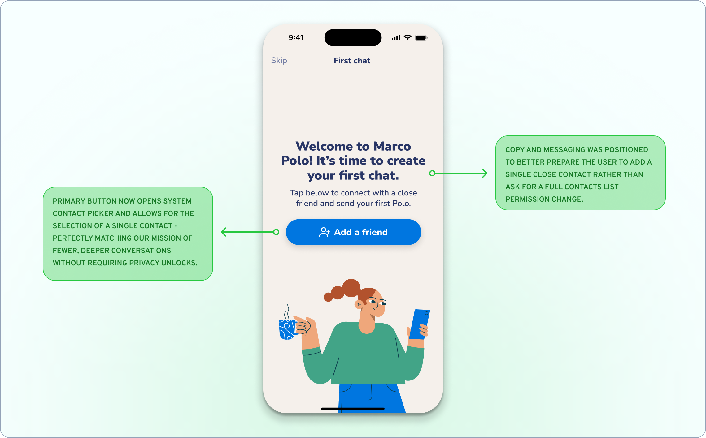
1. Gentle prompt: "It's time to create your first chat!"
2. System contact picker: Tap to browse contacts privately (no permissions needed)
3. Invite confirmation: "Great! We'll send [Name] an invitation"
4. Success state: "Your first Polo is on its way!"
The key insight was using iOS's system contact picker, which lets users browse their contacts without granting the app any permissions. It's completely private but still functional, especially for adding singular contacts.
The Results
The impact was immediate:
• More users sent their first message
• Day one retention increased significantly
• Users reported feeling less confused about next steps
More importantly, we maintained our brand values around privacy while actually improving the user experience. Sometimes the right constraint leads to better design.
AI Design Process
This project was where I really leaned into AI-powered workflows. I used Claude Code to:
• Analyze user feedback patterns from existing research
• Generate multiple solution concepts quickly
• Prototype the flow in our actual codebase for validation
• Create documentation that sped up engineering handoff
Being able to prototype directly in code meant we could test the interaction patterns before committing to full development - something that usually takes weeks of back-and-forth.
What I Learned
This project taught me that simpler isn't always better. My initial instinct was to remove friction by eliminating steps, but sometimes adding the right step - in this case, a thoughtful interstitial - can completely change how users perceive the product. The iOS 18 limitations forced us to be more creative, and honestly, the solution we ended up with respects user privacy more than our original approach ever did.
It also reinforced how powerful AI tools can be for rapid prototyping. Being able to test interaction patterns directly in code collapsed our design-to-development cycle from weeks to days. This wasn't just about fixing an empty screen - it was about preserving the magic of that first Marco Polo moment.
When someone's excited enough to download our app, the last thing we want is for them to hit a dead end. Now users can easily invite that one person they're most excited to video message, without compromising their privacy or feeling overwhelmed by permissions.
Sometimes the best growth tactics are just about making the friction points that kill engagement disappear.

“Cody brought a fresh perspective to user experience challenges, consistently generating innovative ideas for user engagement and growth. His creative problem-solving approach helped us explore new possibilities we might not have considered otherwise. He has a knack for understanding both user needs and business objectives, which made his contributions particularly valuable."